Customize Your Portfolio
Customizing a portfolio is all about being creative. This is your opportunity to make a visual statement that represents the purpose behind your portfolio. When you get to the point of customization, you are entering the world of the designer. In this world there are a few important principles to remember. Below we'll cover a few of those principles and, hopefully, get you started on the right foot.
Basic Design Concepts
First and foremost remember to P.A.R.C.
PARC is an acronym standing for Proximity, Alignment, Repetition, and Contrast. These are the four most basic, rudimentary principles in any design. Here is a brief explanation of each:
Proximity
Proximity involves the placement of like items on a page. You can also think of it as grouping. If you have certain ideas that are similiar and you can put them close to one another, you should do that. The farther away you spread like content the more disconnected your design will be.
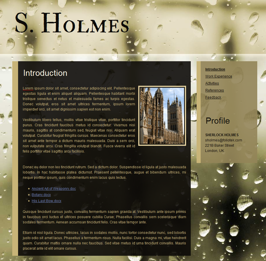
Poor Proximity
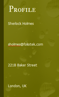
Good Proximity
Alignment
Alignment isn't too hard to figure out. Basically, if you can remember one thing, remember this: Avoid centering stuff when possible. Now that may sound a bit extreme, but playing around with left and right alignment on text will set you apart from 99% of the world. Now that isn't to say there aren't valid reason to center content, but, a majority of the time, that is what we default to without even experimenting with other alignment styles. So, branch out a bit and try some other alignment options before you commit to centering stuff. If you get a chance, check out some quality magazines and see how often they use left and right alignment, you'll be suprised.
Below is a sample of two ways of aligning an image in your portfolio. Both look OK, but the right aligned image is a better use of space and adds visual intrigue.
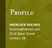
Image Centered
Image Right Aligned

Repetition
Repetition is another way of saying "if you have a good idea, stick with it and use it as much as possible." If you like a certain design element, repeat it frequently. This provides consistency and continuity to your design. What is a distraction, is when formatting elements are constantly changed. For example, you should stick to one or two fonts and standardize the size of fonts you use throughout your portfolio. If you like a certain color scheme, don't change it from page to page, keep it the same, repeat it!
Below are two different pages. The first is an example of very little repetition, the second shows consistently repeated elements.
Poor use of Repetition
Good use of Repetition
Contrast
Contrast is probably the hardest of the group to understand. The good news is that it's still pretty elementary. Designing with contrast in mind means you are paying close attention to colors and what colors look good on top of one another. A very simple rule of thumb is to have dark colors on light colors, or light colors on dark colors. You should avoid light on light or dark on dark unless you are aiming for a specific effect. If you are really interested in what colors look best with one another, use this link to Adobe's Kuler application. This tool is an excellent resource for discovering what colors work well with other colors.
Poor Contrast
Good Contrast